The graph below shows the different modes of transport used to travel to and from work in one European city in 1960, 1980 and 2000.
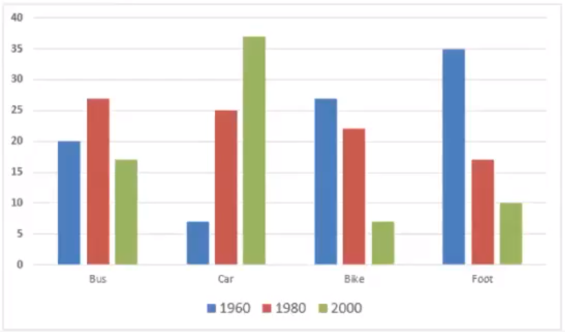
The graph below shows the different modes of transport used to travel to and from work in one European city in 1960, 1980 and 2000. Sample answer 1: The provided bar chart delineates the modes of transportation utilized for commuting to and from work in a specific European city across three distinct years: 1960, 1980, and 2000. Overall, it is evident that while the usage of cars notably escalated throughout the depicted period, the percentages associated with the remaining three modes of transport experienced a contrasting decline. Furthermore, the once-prevalent walking, which held the highest percentage in the initial year examined, was superseded by bus ridership two decades later, ultimately relinquishing its lead to car commuting by the final year of observation. Commencing with car usage, which started at a mere 7%, the proportion of commuters opting for cars surged to a quarter of all travelers, subsequently escalating to a substantial 37% by the final year—an unprecedente...
