The graph below shows the different modes of transport used to travel to and from work in one European city in 1960, 1980 and 2000.
The graph below shows the different modes of transport used to travel to and from work in one European city in 1960, 1980 and 2000.
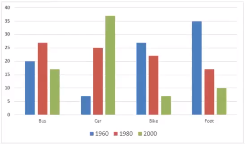
Sample answer 1:
The provided bar chart delineates the modes of transportation utilized for commuting to and from work in a specific European city across three distinct years: 1960, 1980, and 2000. Overall, it is evident that while the usage of cars notably escalated throughout the depicted period, the percentages associated with the remaining three modes of transport experienced a contrasting decline. Furthermore, the once-prevalent walking, which held the highest percentage in the initial year examined, was superseded by bus ridership two decades later, ultimately relinquishing its lead to car commuting by the final year of observation.
Commencing with car usage, which started at a mere 7%, the proportion of commuters opting for cars surged to a quarter of all travelers, subsequently escalating to a substantial 37% by the final year—an unprecedented peak according to the bar chart.
Distinctive among the three alternative modes of transportation is the notable decline in walking, which plummeted from 35% to approximately 17% before further diminishing to a modest 10% in the final year. Similarly, the trend for bicycle commuting mirrored this decline, dropping from 27% to 22% within the first two decades under consideration, before plummeting to a mere 7% by 2000.
Conversely, bus usage exhibited a fluctuating trend, with approximately one in five commuters opting for this mode in 1960, increasing marginally to around 27% by 1980. However, by 2000, bus commuters witnessed a decline to a modest 17%, marking the lowest percentage recorded across the examined years.
Sample answer 2:
The provided chart illustrates the usage of various modes of transportation for commuting in a specific European city across the years 1960, 1980, and 2000, with figures presented in percentages.
Overall, there was a notable increase in the proportion of commuters utilizing private cars, reaching its peak in the latest year, while the percentage of individuals walking to their destinations gradually declined over the decades.
Delving into the specifics of private car usage, a mere 7% of commuters relied on this mode of transport in 1960, marking the lowest among the four categories. This proportion experienced a significant surge to 25% by 1980 and continued its upward trajectory, surpassing 38% by 2000, making it the predominant form of transportation.
Initially, walking was the preferred mode of commuting, with 35% of individuals opting for it in 1960. However, this figure witnessed a substantial decline over the years, dwindling to just one-tenth of office-goers by 2000.
In contrast, approximately 20% of commuters utilized buses for their daily commute in 1960, a figure that escalated to nearly 28% by 1980. However, by 2000, bus users dwindled to less than 20%.
Similarly, over a quarter (27%) of commuters relied on bicycles in 1960, which decreased marginally by 1980, but dramatically plummeted to around 7% by 2000.

Комментарии
Отправить комментарий